
How to Choose Venetian Plaster Well
- aurasuface
- May 15
- 6 min read
A flat painted wall can make even a beautifully furnished room feel unfinished. Venetian plaster changes that. If you are wondering how to choose venetian plaster, the right starting point is not the product name on a sample board, but the mood, light and level of performance you want from the finished space.
Venetian plaster is not a single look. It can be soft and cloud-like, polished and reflective, or richly textured with movement and depth. That range is exactly why it appeals to design-led homeowners, architects and commercial clients - and also why choosing well matters. The best result comes from balancing aesthetics with practicality, so the finish looks exceptional on day one and still feels right years later.
How to choose venetian plaster for the space
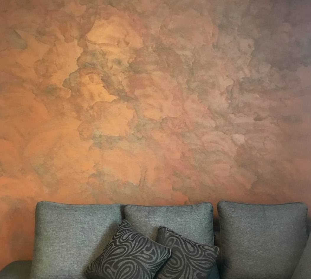
The room itself should make the first decision for you. A dramatic entrance hall can carry more movement, sheen and visual texture than a calm bedroom retreat. A feature wall behind a bed may suit a layered, artisan finish, while a busy hospitality setting may call for something more restrained and durable.
Think first about the role of the surface. Is it meant to create a focal point, add quiet sophistication, or bring warmth to a minimal interior? Venetian plaster works best when it supports the wider scheme rather than competing with every other material in the room. Stone, timber, brass, black metal and soft fabrics all interact differently with plaster, so the surrounding palette matters.
Scale also changes perception. On a small sample, a polished plaster may look subtle. Across a full wall, it can become far more reflective and architectural. Likewise, a heavily textured finish that feels luxurious in a large open-plan setting may feel visually crowded in a narrow room. Choosing the right plaster means imagining it at full scale, not just admiring a hand-held board.
Finish matters more than most people expect
When clients ask how to choose venetian plaster, they often begin with colour. In practice, finish is usually the more important choice. The same tone can look entirely different depending on whether the surface is matte, satin, burnished or highly polished.
A soft matte or low-sheen plaster tends to feel contemporary, calm and understated. It works especially well in rooms where you want warmth and texture without overt shine. This can suit residential living spaces, boutique retail settings and interiors built around natural materials.
A polished finish gives more drama. Light catches the surface, movement becomes more pronounced and the wall takes on a luxurious, almost stone-like quality. It is a strong choice for statement areas, but it does ask more of the room. In harsh lighting or very compact spaces, high sheen can feel colder than expected unless it is balanced by softer furnishings and warmer tones.
Textured finishes sit somewhere else again. They offer tactility, depth and a more overtly artisan look. They can be spectacular, but they are not always the right answer for every project. If the interior already includes heavily veined stone, detailed joinery or bold patterned fabrics, a quieter plaster may create a more refined result.
Choose colour with light, not in isolation
Venetian plaster is prized for its depth of colour, but that depth changes constantly with natural and artificial light. A warm greige in a south-facing room may glow softly through the day. The same tone in a north-facing room can read cooler and more muted.
This is where many choices go wrong. A colour selected from a chart or social media image may bear little resemblance to how it behaves in your own interior. Venetian plaster is layered and hand-applied, so it reflects light with more variation than standard paint. That is part of its beauty, but it also means sampling in context is essential.
Neutral shades remain popular for good reason. Chalky stone tones, warm taupes, soft clay shades and muted greys allow the texture and craftsmanship to come forward without overwhelming the room. Richer tones can be stunning too - deep olive, charcoal, earthy terracotta or moody mineral hues - but they need confidence, suitable light and a scheme that supports them.
If you are matching existing materials, look beyond obvious colour coordination. Consider undertones. A plaster that appears beige may lean pink, yellow or grey. Against oak flooring, marble worktops or brushed brass details, those undertones become much more noticeable.
Durability should shape the decision
Luxury finishes should still work hard. One of the advantages of Venetian plaster is that, when specified and applied correctly, it offers more than visual appeal. It can be durable, easy to live with and suitable for a range of residential and commercial interiors.
That said, not every plaster finish is ideal for every environment. High-traffic areas, family homes, restaurants, reception spaces and stairwells all place different demands on the surface. A delicate decorative finish chosen purely for appearance may not be the best fit where walls are likely to be brushed past regularly.
This does not mean practicality has to dilute the design. It simply means choosing a finish with the right level of resilience and, where needed, suitable protection. Some polished and sealed finishes are better suited to harder-working spaces than softer, more porous decorative looks. The right installer will guide that decision early, rather than treating durability as an afterthought.
Application quality is part of the design
Venetian plaster is not a product you simply buy off the shelf and judge in isolation. The finish is inseparable from the craft behind it. Technique, substrate preparation, layering, trowel movement and final polishing all affect the outcome.
That is why portfolio quality matters so much. Two installers can use similar materials and produce entirely different results. One surface may feel refined, balanced and luxurious. Another may look patchy, heavy-handed or too uniform to retain any artisan character.
When assessing a specialist, look for consistency as well as style. The finish should show depth and variation, but it should still feel controlled. Edges, corners and transitions around sockets, reveals and ceilings tell you a great deal about workmanship. Premium plaster should feel intentional from every angle.
For design-conscious projects, bespoke sampling is especially valuable. It allows colour, movement and sheen to be tested against your actual space and materials, not a generic showroom setting. That stage often saves a project from becoming too glossy, too flat, too warm or simply not aligned with the original vision.
Ask what you want the room to feel like
A useful way to decide how to choose venetian plaster is to stop asking what finish is fashionable and start asking what atmosphere you want to create. Do you want the room to feel serene, architectural, earthy, dramatic or quietly opulent?
Venetian plaster is at its best when it creates emotion as well as surface interest. A pale mineral finish can make a hallway feel brighter and more expansive. A darker burnished plaster can give a dining room intimacy and depth. A softly textured neutral can bring warmth to a minimal scheme that might otherwise feel too stark.
The answer is rarely about choosing the most decorative option. Often, the most successful projects are the most considered. A restrained plaster in the perfect tone and finish can feel far more luxurious than an overtly dramatic one chosen without context.
When bespoke is the better choice
Off-the-peg design decisions tend to show. Venetian plaster has real value because it can be tailored - in colour, texture, movement and finish - to suit the architecture and interior scheme rather than forcing the room to adapt to a standard product.
For clients investing in a premium result, bespoke specification is usually where the finish starts to justify itself fully. That may mean adjusting the sheen to suit soft lighting, creating a warmer neutral to sit against natural stone, or developing a texture that feels distinctive without becoming busy. For high-end residential and boutique commercial spaces alike, those details make the difference between a decorative wall and a statement surface.
Aura Surface approaches plaster in exactly that way - as a bespoke, hand-applied finish designed around the space, not imposed on it.
Choosing Venetian plaster well is really about choosing with intention. Let the room, the light and the desired atmosphere lead, then work with a specialist whose craftsmanship can translate those decisions into a surface that feels considered, luxurious and built to last.


Comments