
How to Match Plaster Colours Properly
- aurasuface
- Apr 24
- 6 min read
A plaster sample that looked perfect on a mood board can turn noticeably warmer, flatter or darker once it reaches a full wall. That is usually the moment people realise how to match plaster colours is less about picking a shade card favourite and more about reading light, texture and material together.
Decorative plaster behaves differently from standard paint. It reflects light with more depth, carries natural movement through the finish, and often reveals undertones more clearly across a larger surface. If you are designing a scheme around Venetian plaster or another hand-applied finish, colour matching needs a more considered approach from the outset.
How to match plaster colours without guesswork
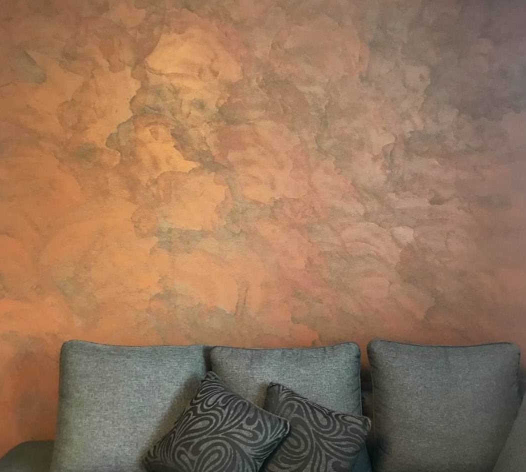
The first step is to stop treating plaster like a flat, uniform coating. Premium plaster finishes have variation by design. That is part of their appeal. A polished surface may catch daylight and appear lighter across high points, while a more textured application can deepen shadow and make the same pigment feel richer.
This means an exact one-to-one match with paint, tile, stone or fabric is not always the right objective. In many interiors, the better result is a balanced match - one that sits comfortably with the wider palette once texture, sheen and natural light are doing their work.
If a client asks for "warm white" or "soft greige", those words are only a starting point. What matters is how that colour lives in the room. North-facing spaces can pull plaster cooler. South-facing rooms can bring out cream, beige and clay notes. Evening lighting can add softness or muddy a tone that looked crisp earlier in the day.
Start with undertone, not the top colour
Most colour mismatches happen because people focus on the visible shade and miss the undertone. Two plasters may both read as beige, but one can lean pink while the other carries a yellow or grey base. Next to limestone flooring, smoked oak joinery or black metal detailing, those differences become obvious.
A useful way to assess this is to place your sample against the materials that will stay in the room. Flooring, worktops, curtains, upholstery and cabinetry matter more than a detached sample book. In a luxury interior, plaster should not feel chosen in isolation. It should feel woven into the scheme.
If you are matching to an existing painted wall, be realistic. Paint often looks flatter and cleaner, while plaster introduces movement and depth. The goal is usually to echo the family of the colour rather than mimic it perfectly. Where a true paint-style match is demanded, the finish may still look different simply because the surface itself behaves differently.
Why texture changes colour perception
This is where decorative plaster becomes more nuanced than paint. Texture alters the way colour is seen. A smooth, burnished Venetian plaster can appear luminous and refined, with subtle tonal shifts across the day. A more stone-like or softly pitted finish can feel deeper and more grounded.
The same pigment in two application styles can produce two distinct impressions. That is why colour decisions should never be made separately from finish selection. If you choose a cooler taupe in a highly polished plaster, it may feel elegant and light. In a heavier texture, it can feel moodier and more architectural.
Use large samples in the actual space
Small swatches are useful for narrowing options, but they are rarely enough for final approval. To understand how to match plaster colours properly, you need to see larger sample areas in the exact room where the finish will be applied.
That is especially true in open-plan interiors, double-height spaces and rooms with changing daylight. A colour can look calm and understated in the morning, then develop stronger undertones by late afternoon. Artificial lighting also matters. Warm LED schemes can enrich earthy plaster tones, while cooler lighting can strip warmth from delicate neutrals.
Ideally, samples should be viewed on more than one wall if the room has uneven light. Corners, alcoves and chimney breasts can all read differently. In design-led homes and boutique commercial spaces, this stage is not a luxury. It is what protects the final result.
Compare samples vertically, not flat on the floor
Wall finishes need to be assessed as walls. Looking at a sample laid horizontally on the floor changes the way light falls across it and can make sheen levels harder to judge. Vertical viewing gives a more honest reading of colour, movement and finish.
It is also worth stepping back. Decorative plaster is not designed to be read from six inches away. Its effect often becomes more sophisticated at room distance, where tone, texture and reflection work together.
Match the mood of the space, not just the reference item
Some colour decisions become too literal. A client might want the plaster to match a sofa, a slab of stone or a favourite tile exactly. Sometimes that works. Often, it creates a room that feels forced.
A more refined approach is to ask what role the plaster needs to play. Should it soften a scheme built around sharp architectural details? Add warmth to minimal joinery? Bring quiet texture to a room with strong furniture silhouettes? Once that role is clear, the colour match becomes easier to judge.
In premium interiors, the most successful plaster colours usually support the atmosphere of the room rather than compete for attention. Soft chalky tones, layered neutrals, mineral greys and warm stone shades tend to age well because they work with the architecture instead of chasing a trend.
Expect variation in hand-applied finishes
Bespoke plaster should not look machine-made. Hand-applied finishes have character, and that character affects colour. Slight tonal movement, passing light reflection and artisan texture are all part of the final look.
For some clients, this is exactly the attraction. For others, especially those expecting a paint-flat result, it can be a surprise. The key is setting the expectation early. Matching plaster colours is about controlling the overall visual outcome, not removing every trace of movement from a handcrafted material.
This is one reason specialist sampling matters. An experienced applicator can adjust pigment balance, finish technique and sheen to move closer to the desired result. That expertise is far more valuable than relying on a generic colour chip alone.
How to match plaster colours with existing finishes
When plaster is being introduced into an established interior, three things matter most: light, neighbouring materials and finish contrast. If your timber has a warm honey base, a cool grey plaster can feel detached. If marble carries subtle green veining, a neutral with the wrong undertone may suddenly look pink.
It also helps to think about contrast in finish rather than colour alone. A plaster wall beside matte cabinetry or brushed metal can add depth even if the tones are very close. In some spaces, that gentle tonal layering feels more luxurious than a stronger colour difference.
For renovation projects, there is another practical point. Older walls, patched surfaces and previous coatings can all influence the final appearance if preparation is inconsistent. A beautifully chosen plaster colour still needs the right base to perform as intended.
When an exact match is worth pursuing
There are situations where tighter colour matching does make sense. Feature walls aligned with bespoke joinery, hospitality settings with strict brand palettes, or minimalist interiors built on very controlled neutrals often benefit from precision.
Even then, the finish should be tested in context. Exact pigment matching does not guarantee exact visual matching once sheen, movement and application style come into play. It is always the full surface effect that matters.
The value of a specialist eye
Luxury decorative plaster is as much about judgement as material. Knowing whether a shade needs more warmth, less grey, a softer sheen or a different texture can be the difference between a wall that looks expensive and one that simply looks beige.
That is why specialist guidance is useful early in the design process, particularly for statement spaces. Entrance halls, open-plan kitchen living areas, stairwells and boutique commercial interiors all benefit from a finish that has been colour-matched with the architecture in mind, not selected as an afterthought.
For clients looking for a bespoke result, Aura Surface approaches colour as part of the full surface design - balancing tone, light and artisan application to create walls that feel considered, not generic.
The right plaster colour should never feel pasted on. It should feel as though it belongs to the room, catching the light beautifully, sitting naturally with the surrounding materials, and adding the kind of quiet luxury that only a hand-finished surface can bring.


Comments